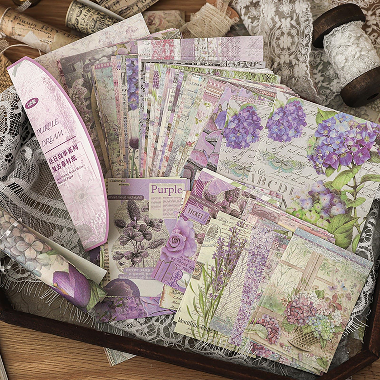
How to lay out a journal page in three layers
A journal page reads as designed rather than decorated when you build it in three layers: a background that covers the page, a mid-ground that groups the elements you want seen together, and a foreground of small pieces placed on top. The order matters more than the taste — each layer is allowed to be plain because the previous one is already doing the work.
The idea
The reason most decorated pages look busy is not too many stickers. It is that every element sits on the same visual level, so the eye has nothing to travel along. Three layers fix that, and they map onto three physical passes over the page.
Layer 1 — background
Something that covers most of the spread: a piece of patterned paper, a torn strip, a tinted wash. It should be quiet. If the background is the loudest thing on the page, nothing you add later will register, which is why the full-sheet vintage flower packs work better here than the busy designs.
Layer 2 — mid-ground
The two or three pieces that belong together: a photo, a ticket, a cutting, a memo block. This is where the page gets its subject. Glue these down and then leave the page alone for a minute, because the next layer only works if this one is settled.
Layer 3 — foreground
Small, deliberate marks: a sticker, a strip of tape, a stamped word, a drawn line. They anchor the mid-ground and tell the eye where to stop. Three to five pieces is usually right; more and you are back to a pile.
Why the order is not negotiable
Each layer is the reason the next one can be simple. If you place stickers first you will cover the good part of your paper, and if you glue the mid-ground before the background is flat the page buckles at the edge. Working in order also means a page you run out of time for still looks finished — the first two layers alone are a complete spread.
The process
Step by step
- 1
Pick one background sheet
Lay the sheet on the page, do not glue it yet. Trim it slightly smaller than the spread so a border of the page shows — that border is what makes the paper look placed rather than pasted.
- 2
Place the mid-ground before gluing
Put down the two or three pieces that carry the subject and move them around until the page balances. Photograph it with your phone — the camera flattens the spread and shows a lopsided layout faster than your eye does.
- 3
Glue the mid-ground with a glue pen
A glue pen along the edges, not a glue stick across the whole back. Edges-only keeps thin paper from cockling and still holds a photo flat.
- 4
Add the foreground last, and stop early
Three to five small pieces. If you think the page needs one more, it usually needs one fewer.
- 5
Date and sign it
A small pencil line in a corner — the date, or two words about the day. It gives the eye a final resting point and makes the spread useful in a year.
Small things that matter
- Tear paper toward yourself for a soft edge, cut with a blade for a hard one. Mixing the two is what makes a spread look handmade rather than printed.
- Keep a scrap sheet beside you and test every glue on it first. A glue that strikes through thin paper is a ruined page, and you only find out after it dries.
- Work on one spread, not a whole notebook. Two finished pages beat twenty pages with a background and nothing else — and the second kind is what makes people give up on journaling.
- Place the largest mid-ground element off-centre. A perfectly centred layout has no direction and looks like a poster rather than a page.
Made something with these?
Readers post their finished pages on the Journal wall — a photo and a line about how you built it is plenty.